
UX Case Study: CragCast
A dive into my design thinking process to create a weather app for rock climbers.
Overview
I created this app during my Certified UX Design Course through Career Foundry. My goal was to create an app which would provide beautifully displayed and easy to understand weather information for outdoor rock climbers.
My Roles: UX Design, UI Design, User Research, Information Architecture, User Testing
Tools Used: Balsamiq, Figma, Usability Hub
Duration: 6 months (as part of a project-based design course)
My Process
I followed the design thinking process in 4 phases:
Understanding the User: Conducting user surveys, user interviews and affinity mapping to create user personas, user flows and user journey maps.
Foundational Design: Crafting wireframes and an initial clickable prototype.
Usability Testing: Discovering friction points and problems in the user experience early on.
Refining the Design: Analyzing the data collected from user testing and reiterating solutions.
Phase 1: Understanding the User
User Surveys
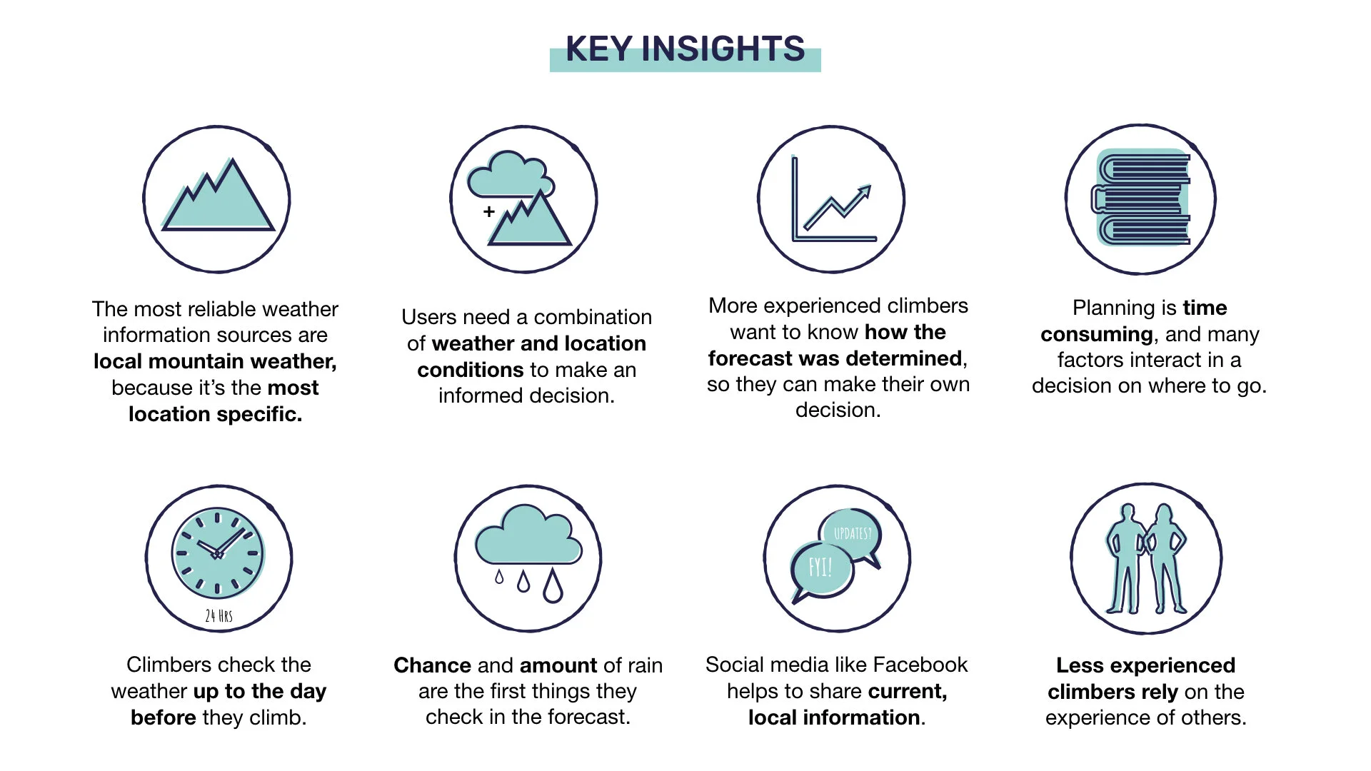
I created an online survey and sent it to a local climbing Facebook group. With fast results and minimal effort, I gained an initial insights from the climbing community which helped me to create the right questions for my in person interviews.
User Interviews
I then conducted 6 in-person user interviews, which gave me the opportunity to dig deeper into their answers, see the behavior and reactions of participants, and get face to face with the climbing community.
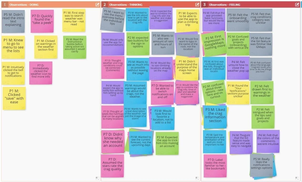
Affinity Mapping
I pinpointed actionable data points by affinity mapping, which enabled me to separate important details, group similarities, and visually decipher what each person was doing, thinking and feeling when planning climbing outings.
User Personas
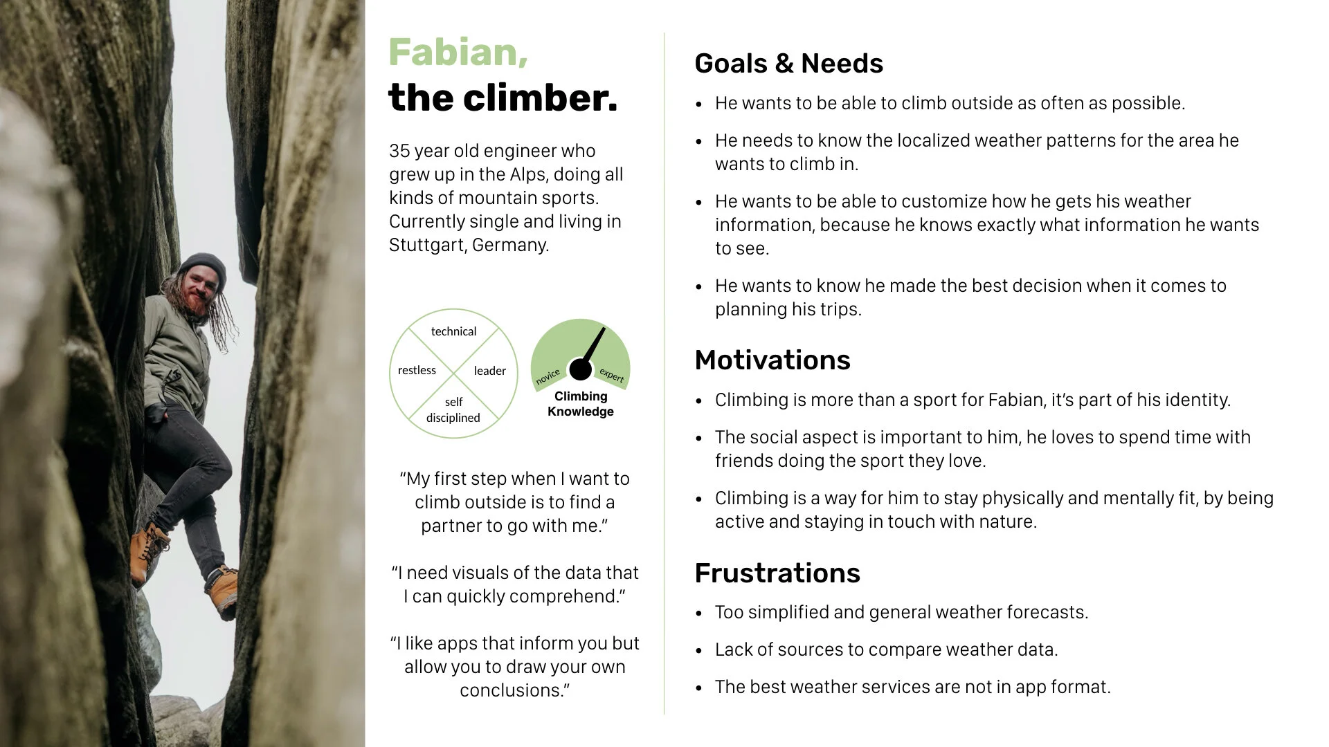
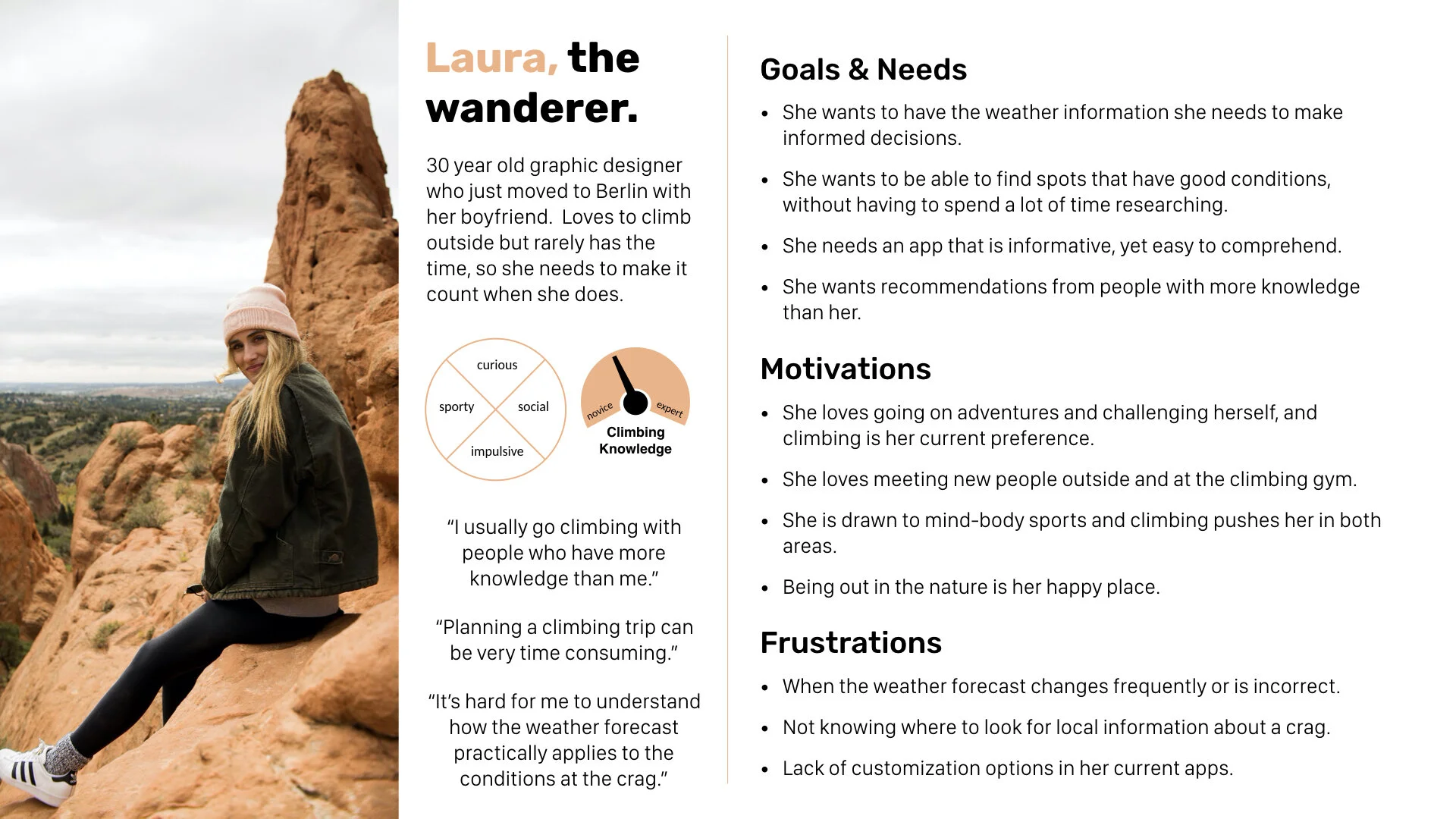
I crafted two user personas, Laura and Fabian. This allowed me to combine all of the important information about the climbers into a relatable resource which I could always refer to, to ensure the user remained central to the design process.
User Flows
I created user flows for each persona. Visualizing what goals they would potentially use the app to achieve helped me to define what steps they would take to get there, and create a structure to focus the designs on.
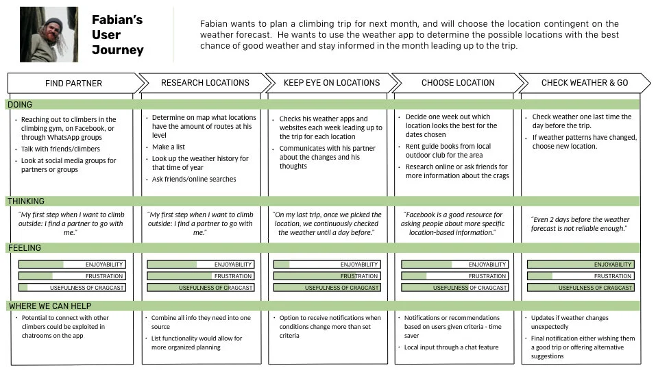
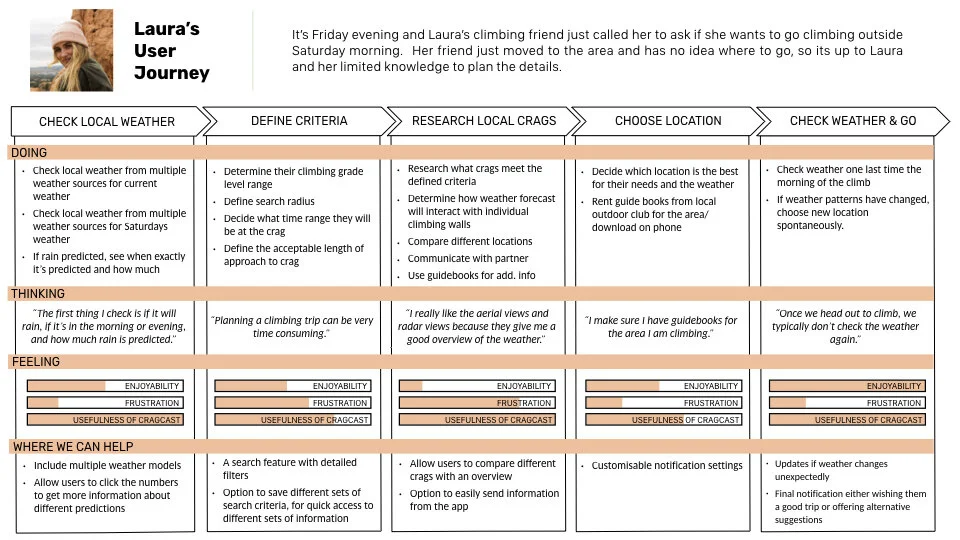
User Journey Maps
I then made user journey maps by imagining what scenarios these user flows might be taken in. I could begin to understand what they may be doing, thinking and feeling in those moments, and where we could make the most impact for them.
Defining the problem
Through all of this valuable information, I defined the problem as:
Outdoor climbers need an accurate source of location-specific weather information which enables them to quickly make well informed decisions on where to climb, because their time, energy and safety depends on making the right choice.
Phase 2: Foundational Design
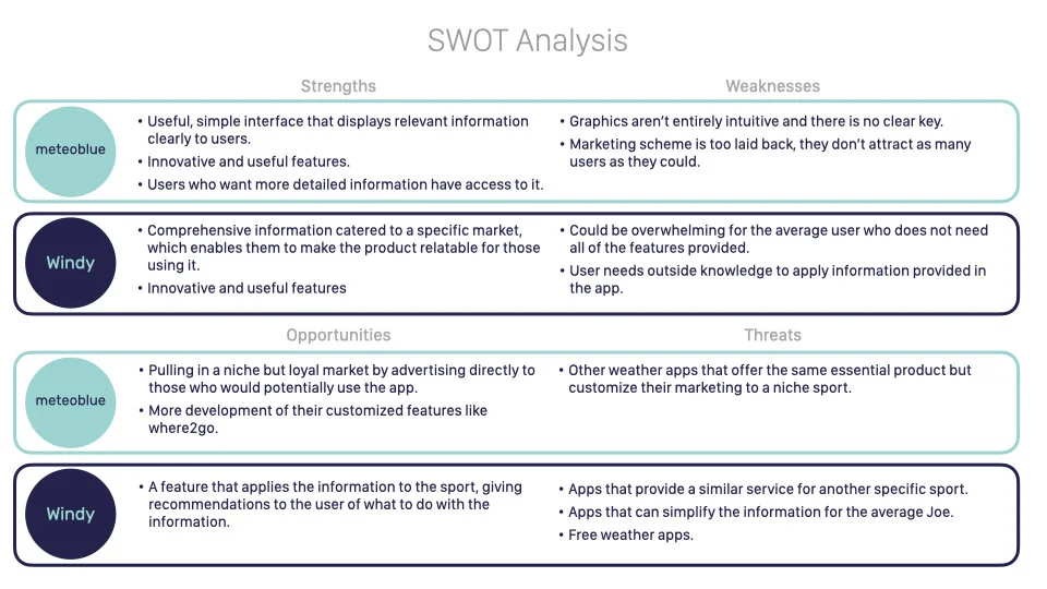
Competitor Research
I conducted a detailed competitor analysis because I wanted to know what kind of apps were already providing weather services to climbers in order to identify potential opportunities. I then did a UX analysis of those apps, which enabled me to identify the key feature, how they ensured high usability for the users.
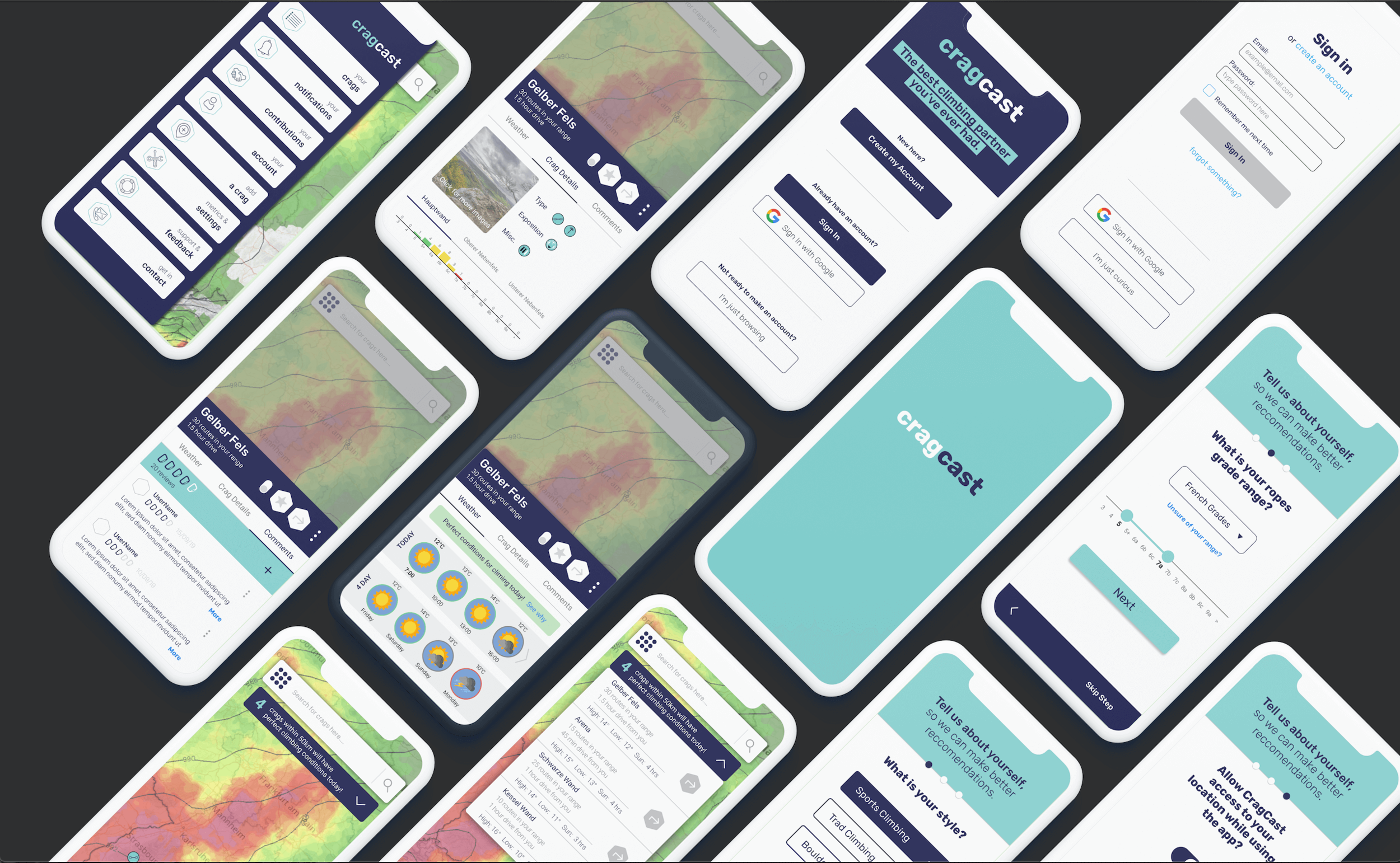
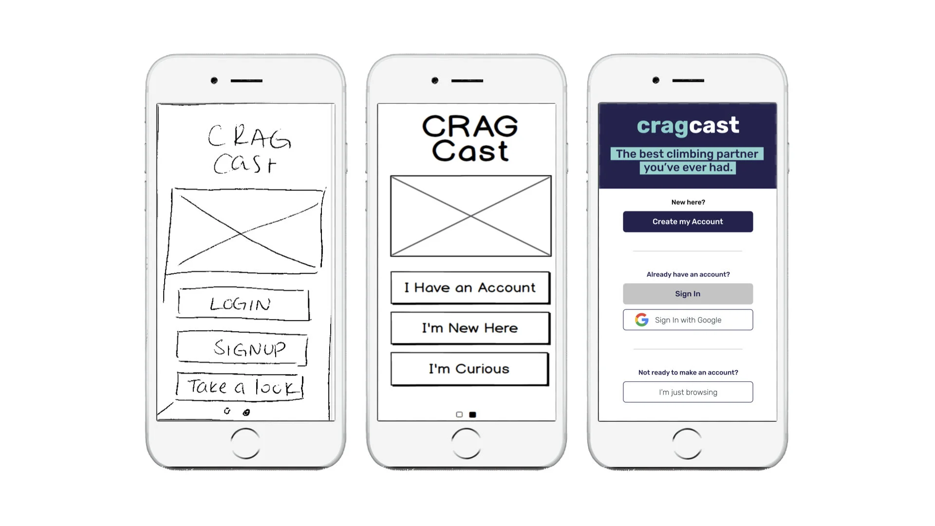
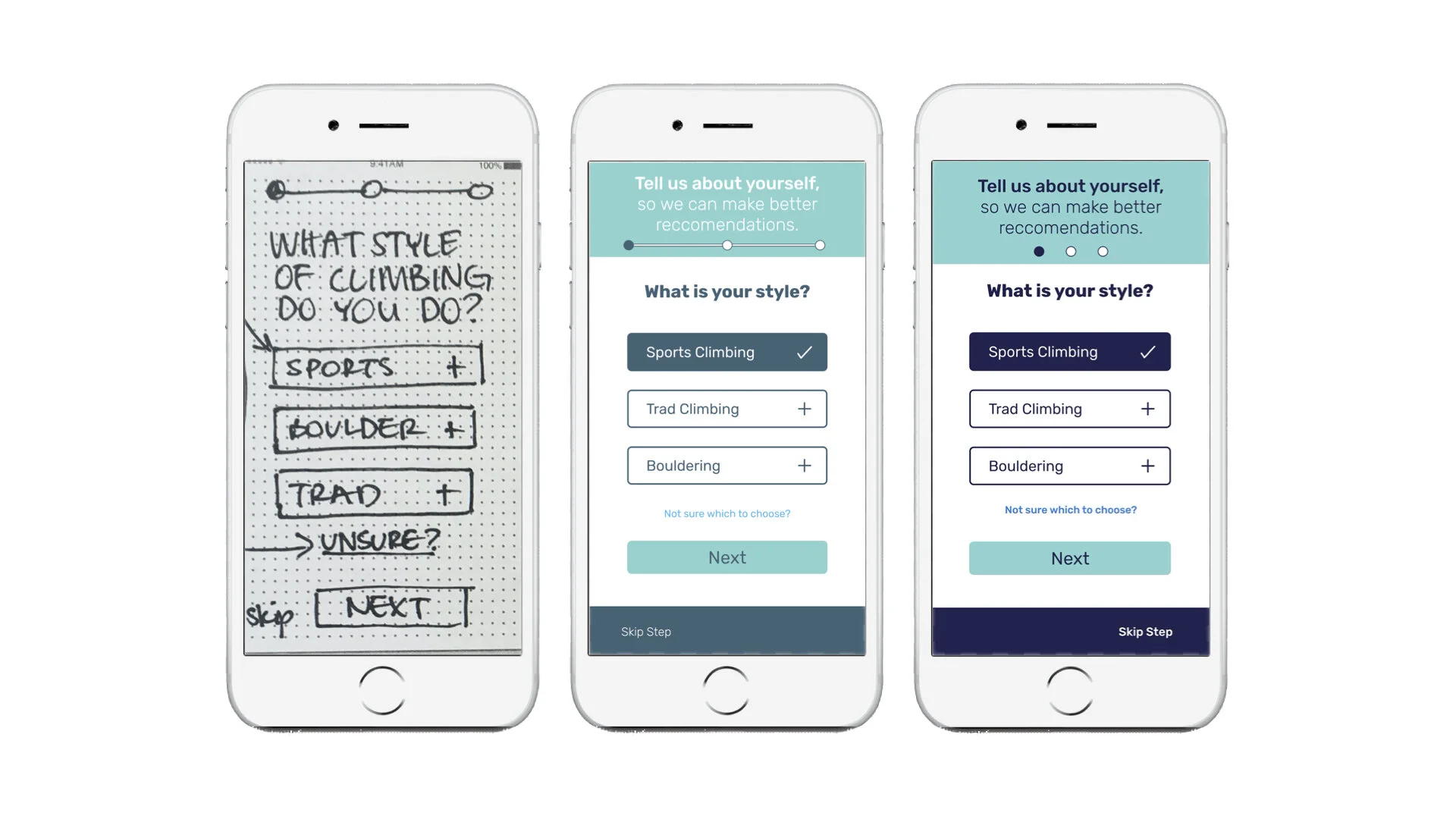
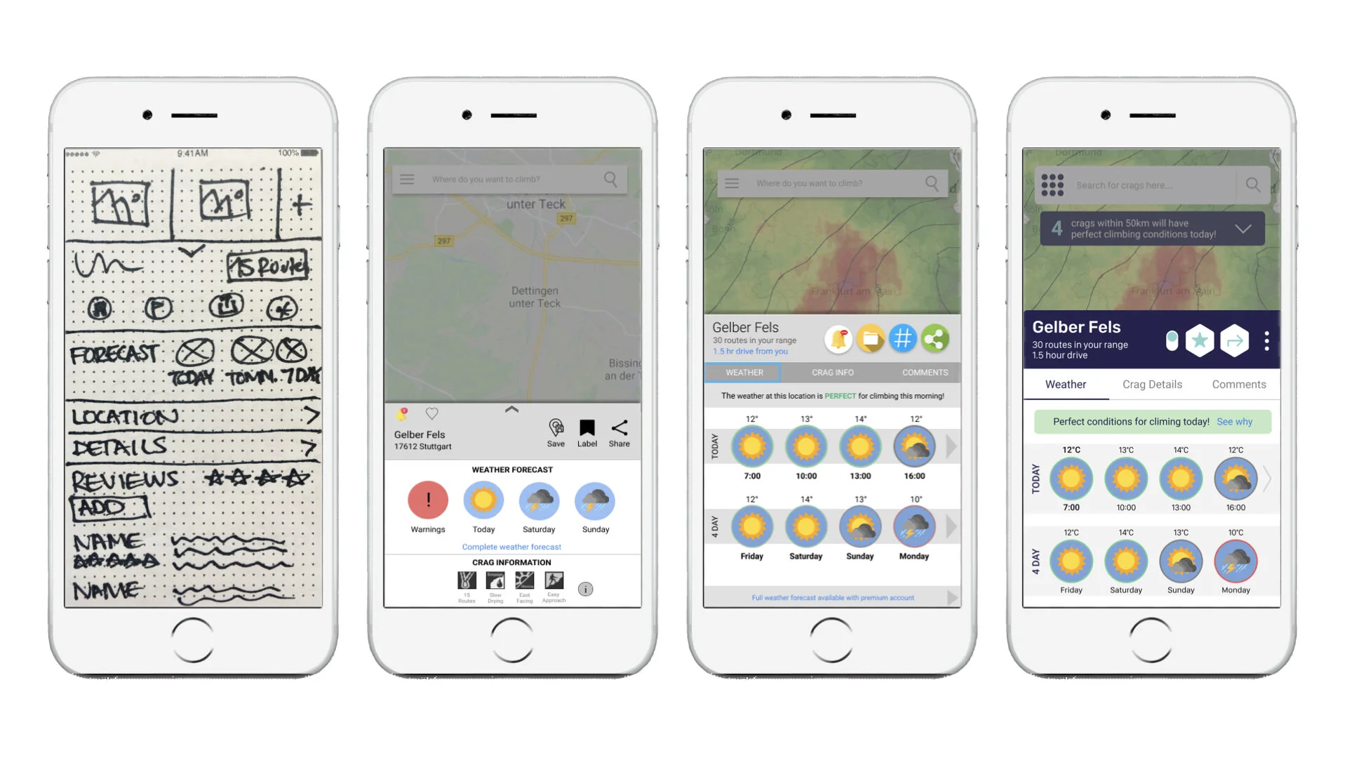
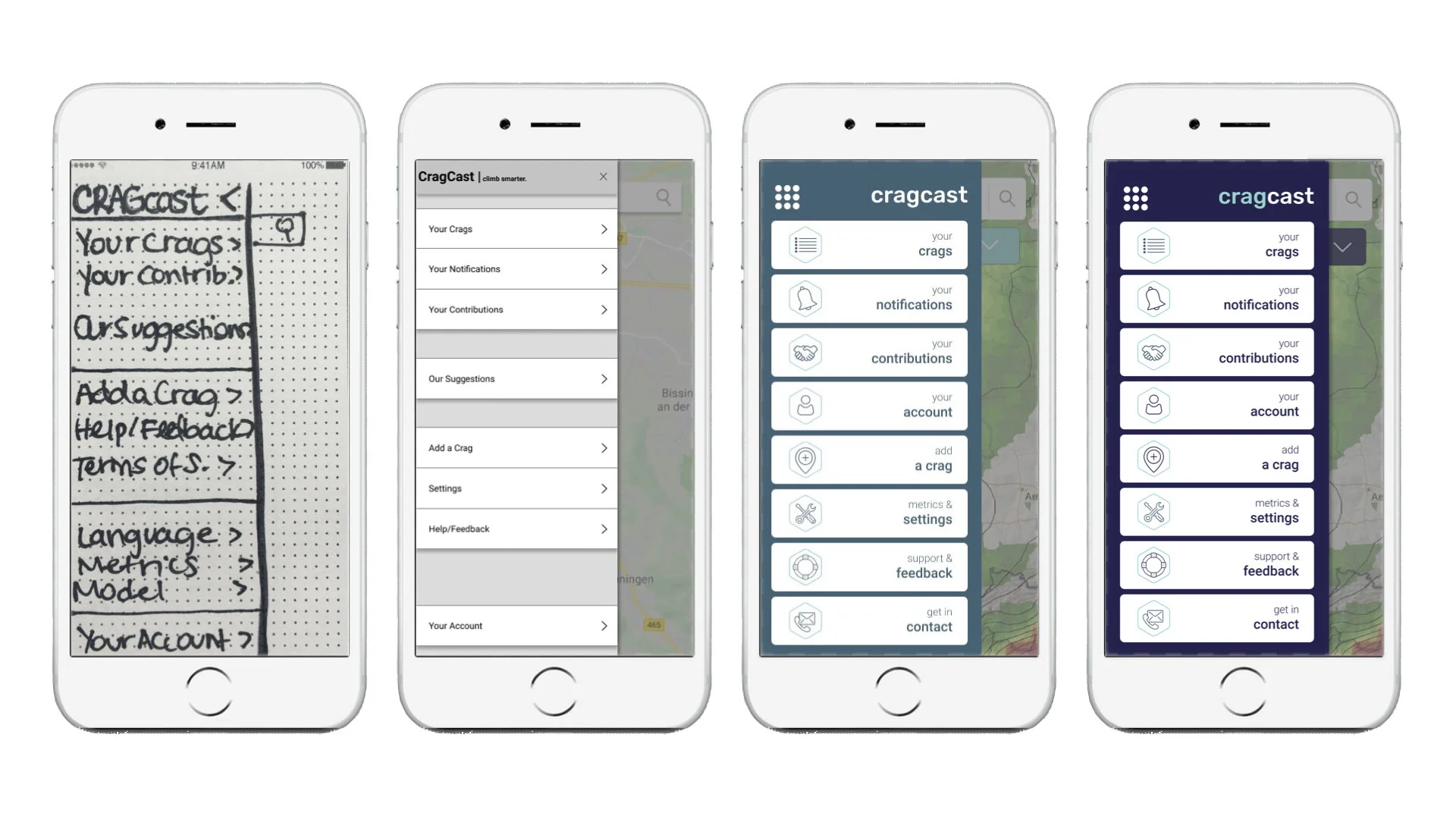
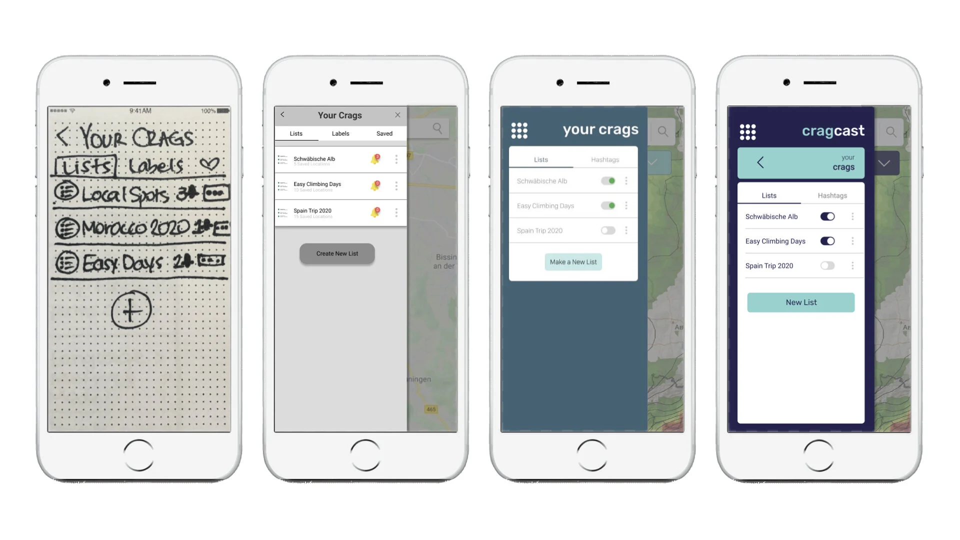
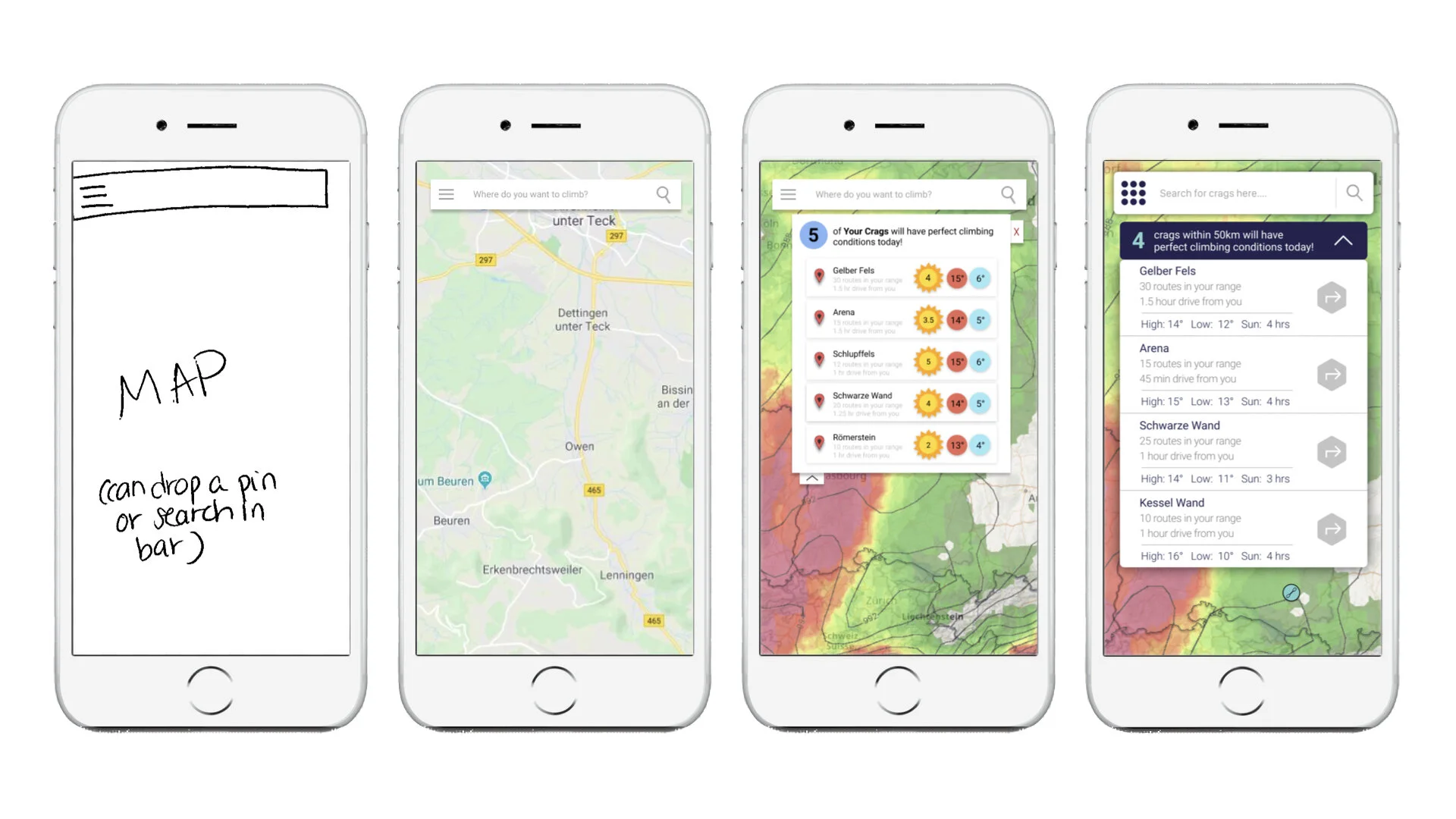
Wireframing
Using this information, I sketched multiple rounds of wireframes, which gave me the chance to flesh out as many ideas as possible, and then choose the best ones from them:


Phase 3: Usability Testing
The Test
I developed a test plan and script, which provided a structure for me to ensure consistency across tests, and to plan ahead what I wanted to test and how.
I then conducted 6 usability tests, because I wanted to gather both qualitative and quantitive data about the users first experience with the app, have the chance so see first hand how they interacted, and be able to ask follow up questions.
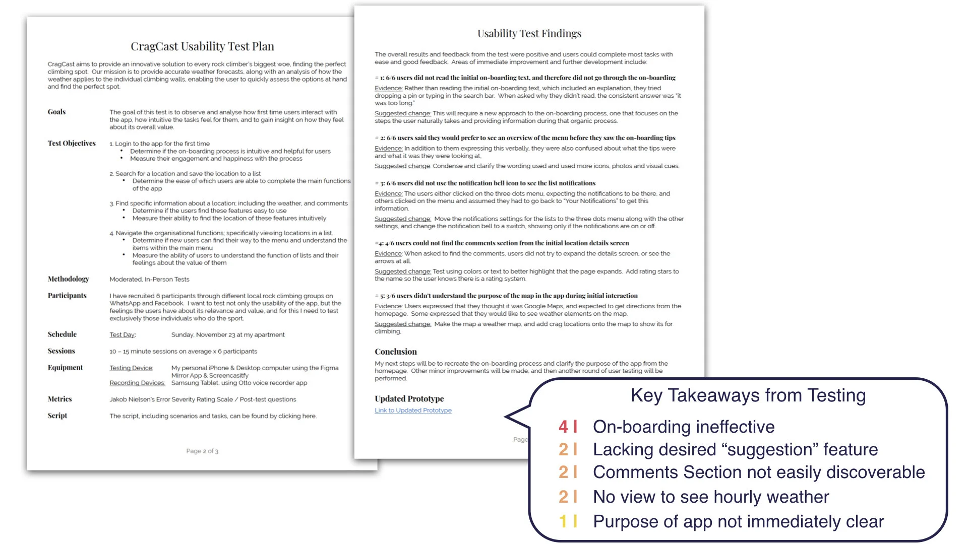
The Results
I measured and analyzed the results, and defined the changes to be made. I used Neilsen Normans Error Severity Rating Scale which combines the frequency, impact, and persistence of each problem into a single severity rating, prioritising the issues and allowing for quick action on those with the largest impact.
I focused on the highest severity issues from the usability tests for the next iterations.

Phase 4: Refining the Design
Reiterate & Test
After creating new iterations for the major changes, I retested them multilple times and in various forms, including peer reviews and preference tests using Usability Hub. Each time, I prioritized the changes to be made, and kept a list of to-do items that would take more time, but I wanted to get to later. This allowed me to focus on the changes that would make the biggest impact for usability.
Accessibility
I insured that all font sizes, color contrasts, and wording were in compliance with the Web Content Accessibility Guidelines (WCAG) 2.0 , to insure my app was accessible for everyone.
My Takeaways
As my first dive into UX Design, I learned so much during this process. In addition to a host of amazing tools and methods, I uncovered a lot about myself. I discovered that:
while attention to detail is important, getting the project tested early on more valuable than making it perfect the first time around,
sometimes I can lose sight of the big picture, so I need creative ways to keep me focused and on track,
developing a system for organization early on saves A LOT of time later,
and most of all, this process was a lot of fun and made me even more confident about choosing a career in UX design.
Thank you for reading, and please feel free to leave your thoughts and comments on my Behance page!