
Case Study: Marco Polo Redesign
In order to challenge myself creatively and develop my design skills, I took a dive into Marco Polo’s Video Messaging app to attempt to rethink to some of their key user experiences.
Note: I do not work for MarcoPolo, and have created this redesign on my own merit. I love the app and use it all the time, so this is in no way intended to discredit what they have already created. In addition, I do not have access to the data influencing Marco Polo’s decision making process, and therefore my ideas are just that, my ideas :)
Overview
About a year ago, I made the decision to stop teaching English as a foreign language and to focus on becoming a UX designer. I enrolled in a course to learn UX design, and designed two apps with the help of the course community. With all of these new skills and ideas in my head, I wanted to challenge myself creatively and redesign an app that I already knew and was familiar with. I chose to redesign Marco Polo, an innovative video messaging app.
My Roles: UX Design/UI Design
Tools Used: Sketch and Invision
Duration: 1 Day
My goals for the redesign:
increase the users ability to manage their conversations within the app
To design a more "conversational" flow in the interface
To maintain a seamless experience within the current interface
My personal design goals:
To effectively apply the principles of user centered design to an existing app
To further develop my wireframing and prototyping skills in Sketch and InVision (I had previously used Figma for both wireframing and prototyping and wanted to see which tool I preferred)
To do it quickly. I finished in one day (where as my class projects took months)
About the App: Marco Polo
Marco Polo’s website states that the app is “more like having a conversation in real life.”
It essentially allows you to have a conversation through videos. Because the videos aren't live the user can watch it and respond whenever they have time, allowing both parties to continue the conversation on their individual time. Users can also send photos through the app and add text and filters to videos.
As an American living in Germany, Marco Polo has become such a valuable resource for my family, friends, and I, but is missing what I believe to be some essential features to keep it functioning like a real conversation. Because of this, I decided to focus on redesigning three key user experiences with an ultimate goal in mind: keep it conversational.
My process
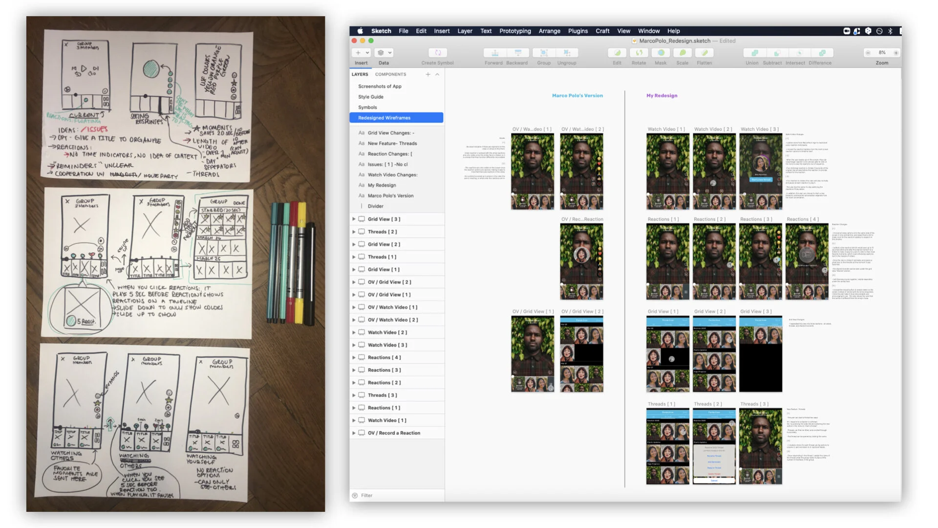
I got to work by redesigning what I consider to be 3 essential user experiences in the app: video reactions, organizing the conversation, and favorite moments (each explained in more detail below). I got out my pen and paper to sketch out some initial wireframes, and then opened up Sketch to digitalize them.
I took this opportunity to first re-create the existing app within Sketch, down to every icon. This was great practice and quickly improved my wireframing skills. From there, I created my revised versions.
User Experience #1: Video Reactions
How video reactions work
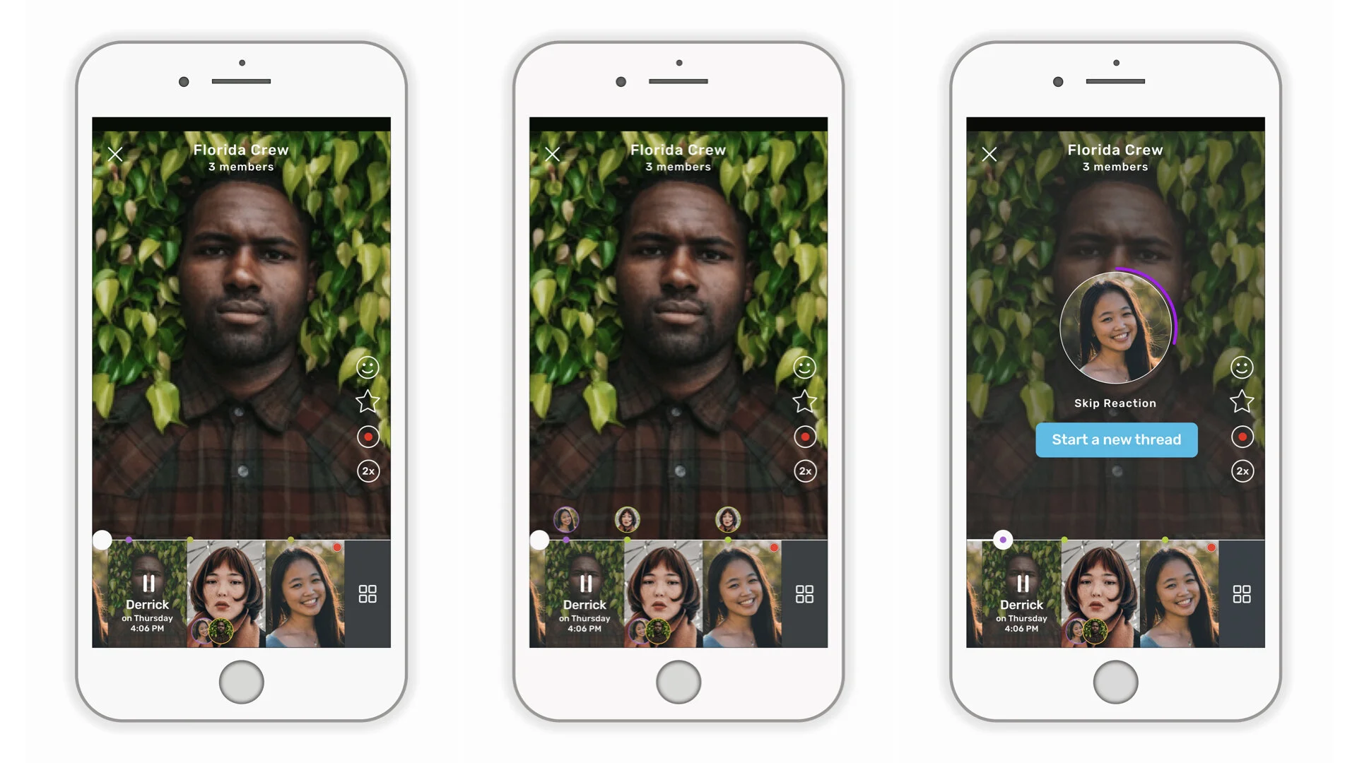
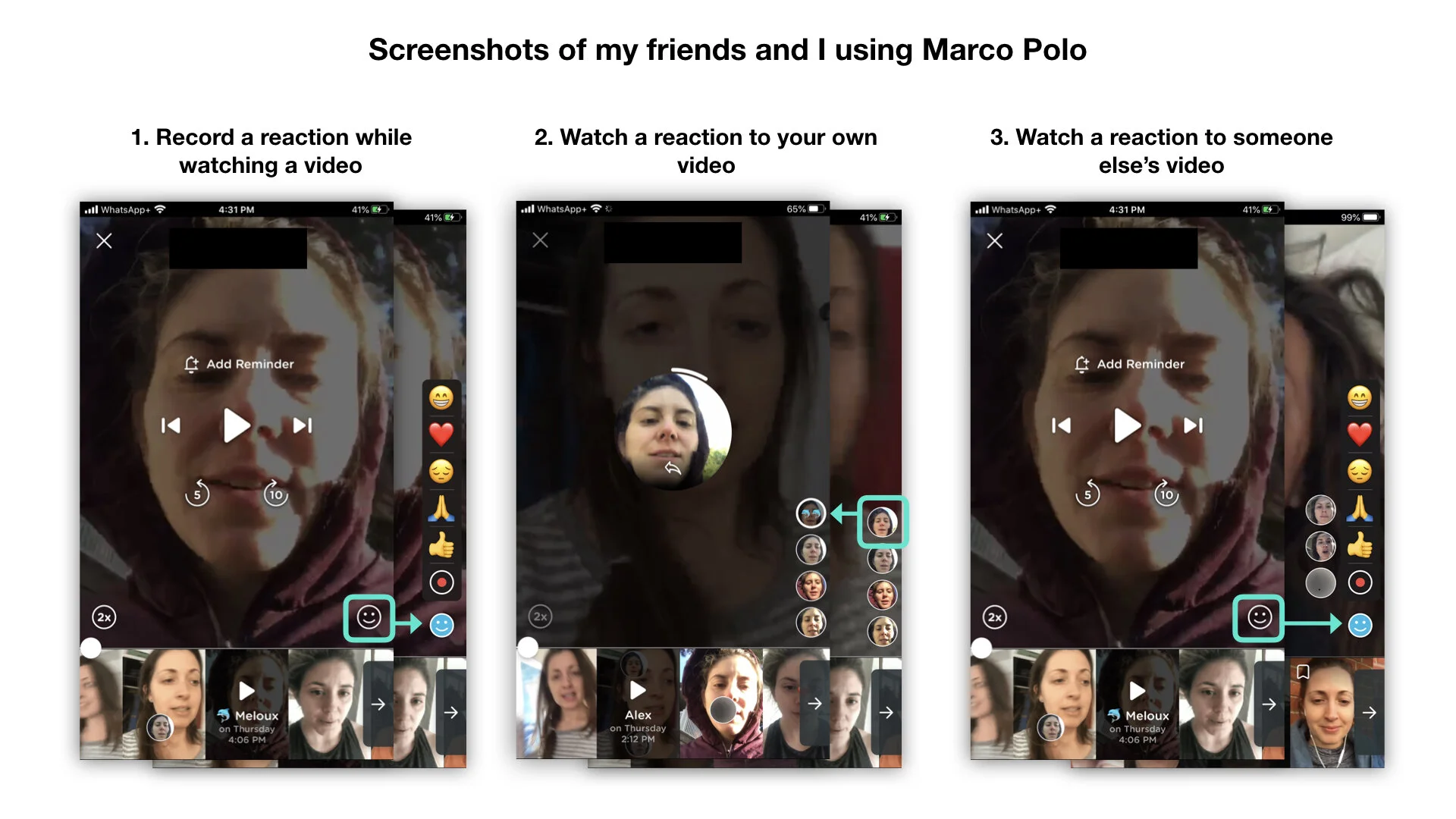
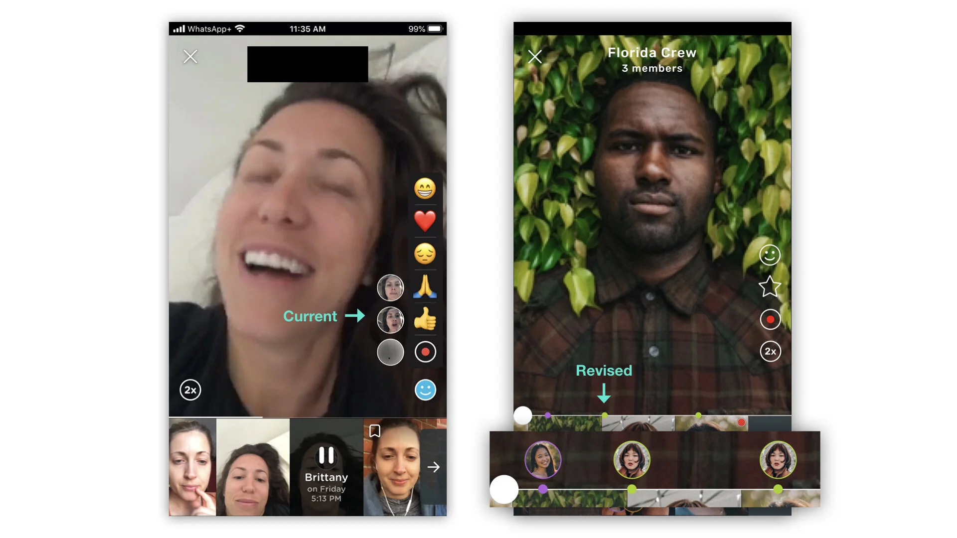
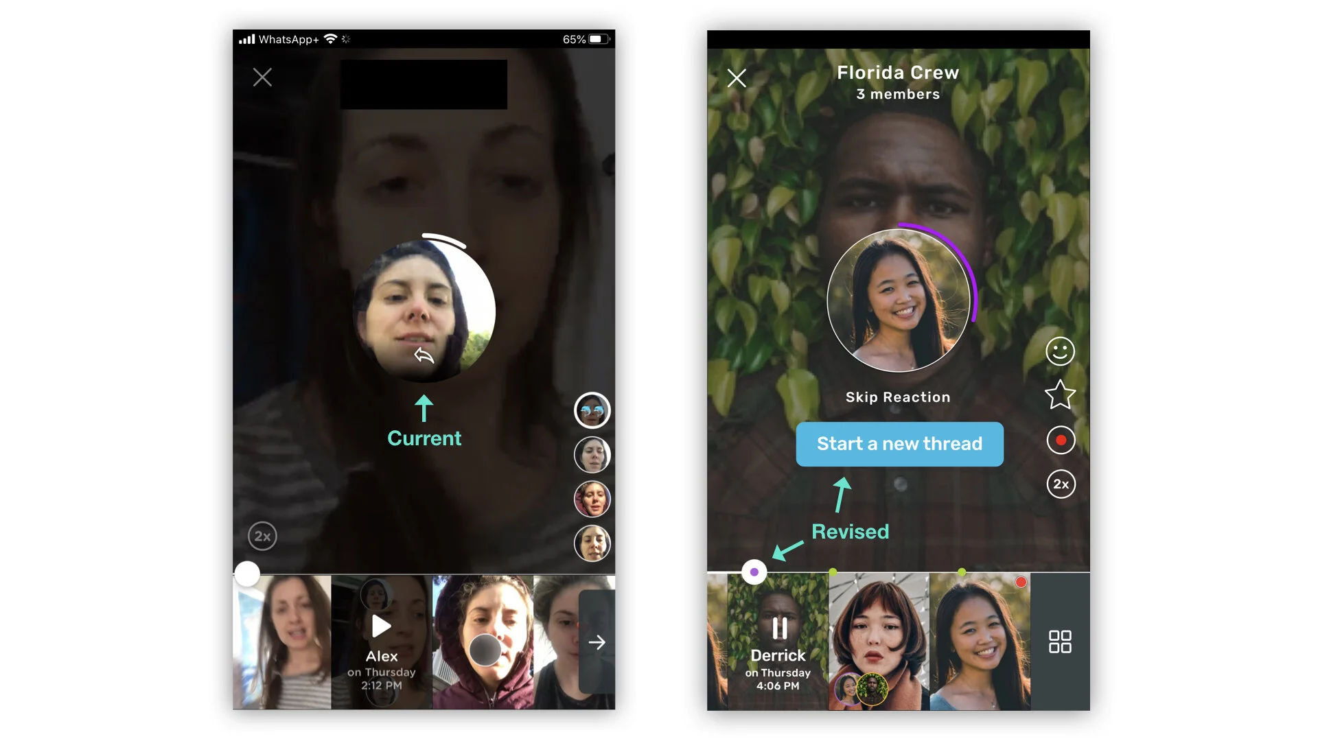
Currently, the user has the option to react in someone else's video by clicking the smiley face icon in the bottom right corner of the screen. They have the option to react with an emoji icon or to record a short video reaction (see photo 1 below). When watching reactions on your own video, those reaction clips sit on the right side of the screen and can be watched as individual video clips (see photo 2 below). If you are watching someone else's video, the reactions are then only visible once you click the reaction smiley face (see photo 3 below).
The problem
In all the time I have used the app, I have used the emoji reactions only a handful of times. As for the video reactions, two times maximum. They don’t serve any real value for me, and have frustrated me more than anything when I have used them. For this redesign, I asked myself why this was the case, and how to make them more useful.
I concluded that the current reactions lack value because they are missing context. Once the reaction is recorded, it becomes a face that sits on the side of the screen, its references and meaning lost somewhere in the video. The people watching the video can only see the reaction itself, but not what the person is reacting to or where it lies on the timeline (photo 2). In addition, the location of the reactions changes when viewing your own video or someone elses, which can become disorienting.
My proposed solutions
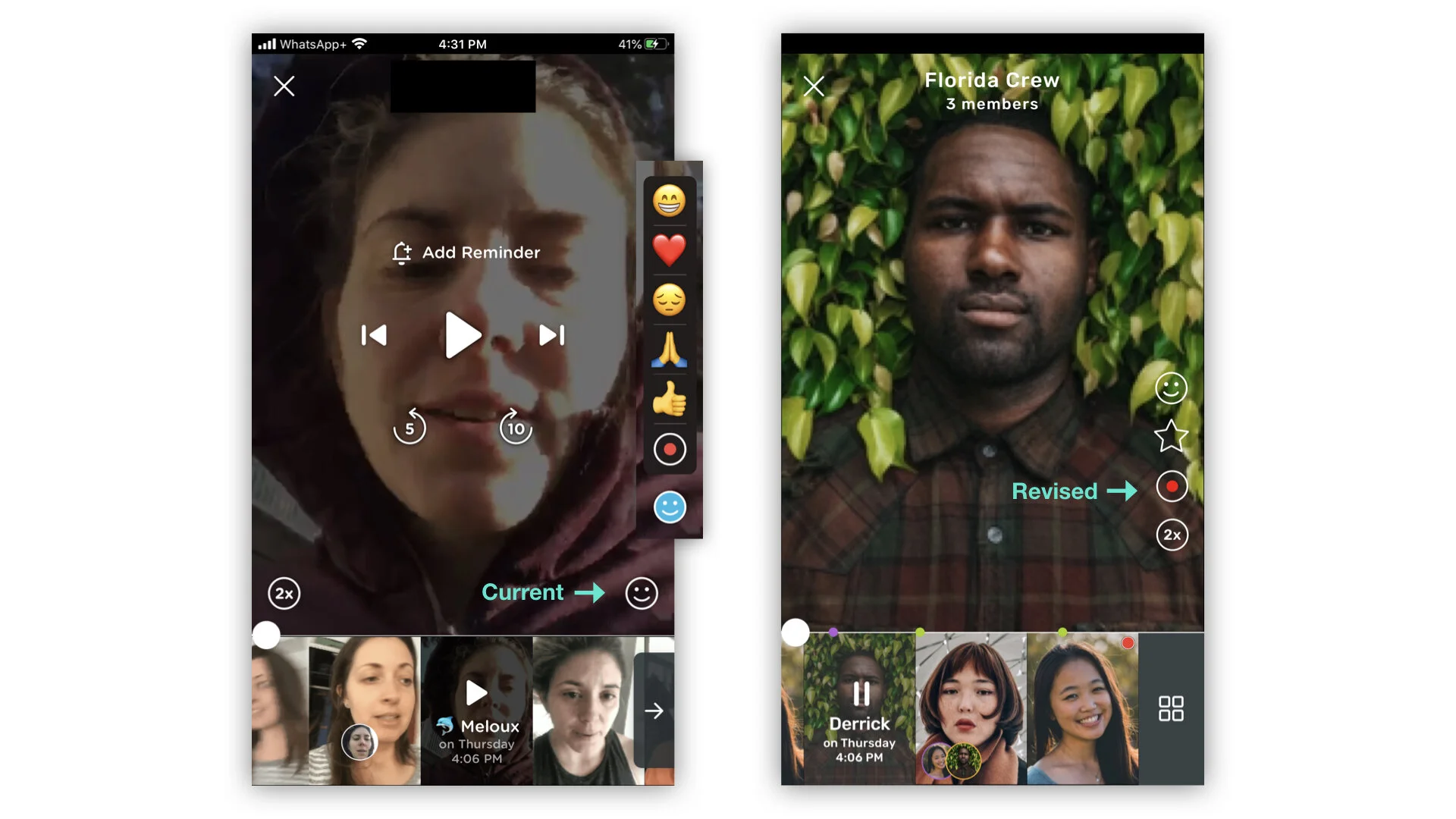
#1: Make the "record reaction" button stand out.
The "record" button is currently packed in with the emoji reactions, leaving the user potentially confused about its purpose or even worse, missing it all-together. I propose this button be moved outside of the stack, and left statically on the screen. This transforms the icon into a distinct call to action, rather than something the user has to actively seek.
I would also move all of the video action icons to the same side, using Gestalts law of grouping to improve clarity. In addition, I added the star icon here (more on this later in User Experience #3: Favorite Moments).
#2: Migrate reaction bubbles to the timeline, and give them context.
I propose to move the reaction bubbles onto the timeline. By using the variety of colors from Marco Polo's logo, each user can have their own color in the chat. The reactions are marked by a colored dot on the timeline, which can be expanded by swiping up on the screen to reveal the face bubbles of each reaction.
By clicking the face bubble, it plays 10 seconds of the original clip to provide reference, and then plays the reaction clip.
#3: Integrate the reactions into the conversation and allow break-outs from the main conversation when needed.
Currently, when you play a reaction, it plays as a stand alone video, with no context and no reference to the timeline. In addition, if you want to directly respond to a reaction, it only allows you to do so in a private message to that person, removing you from groups or the current chat.
I propose this: when the video plays normally, it should automatically stop when there is a reaction on the timeline and play that reaction. This is how a conversation would naturally flow: content, reaction, content, reaction. The user would also have the option to skip the reaction if they didn't want to watch it at that time.
If the reaction warrants a deeper discussion, I propose to let the users break out of the main conversation and create sub-discussions, called "threads." Keep reading for more explanation on this.
User Experience #2: Organized Conversations
The problem:
Marco Polo markets itself as a digital substitute for real conversations. The problem is that unlike the apps structure, conversations are not linear. They tend to go off on tangents, in all kinds of directions, and take all kinds of different forms. When managing all of these conversational paths in one group chat, a lot of information tends to get lost or forgotten.
For example, my friends and I wanted to keep each other accountable with our progress in certain yoga positions, namely, forearm stands. We promised to push and inspire each other through our Marco posts. But with no way of filtering the videos to see only those related to the topic I wanted to look at, the motivation was ineffective. We posted maybe three updates before our valiant attempt ended.
My proposed solution:
My solution for this is creating sub conversations called "threads" within the group or conversation. By doing this, the main conversation can ebb and flow as it will do, but any time an especially important or distinct topic arises, its responses can be organized into a new and easily accessible space.
#1: Starting a thread.
Users could start a thread by either pressing on a video tile to open the video menu, and then pressing "start a thread" (2nd photo). Alternately, they could start one directly from a reaction (3rd photo).
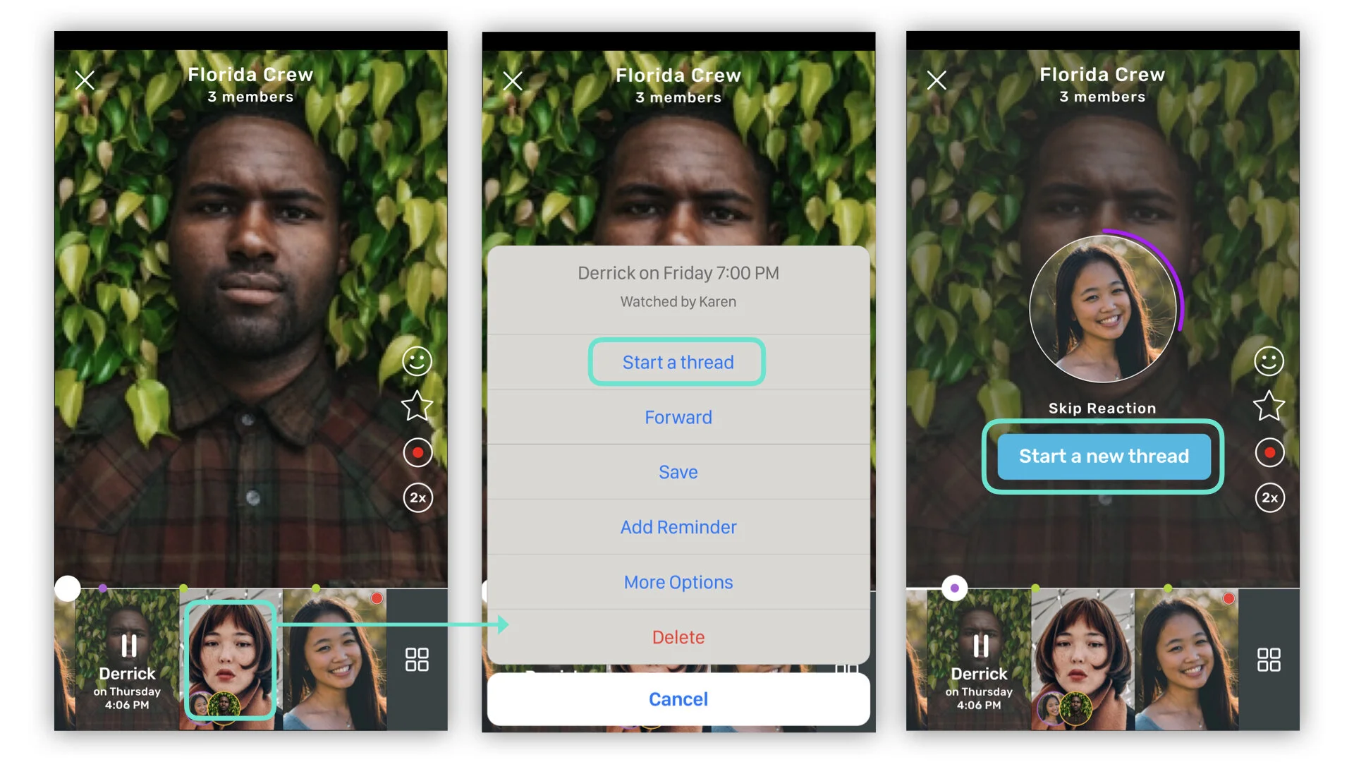
#2: Managing threads.
Threads would then be stored under the same section that is currently used for the grid view of all videos. I propose adding a new sub section here called "threads" which then houses all break out conversations.
Within this view, the users could also give the threads names to further organize their topics. I have used some real world examples in the photo below, showing some of the topics that keep reoccurring in my conversations.
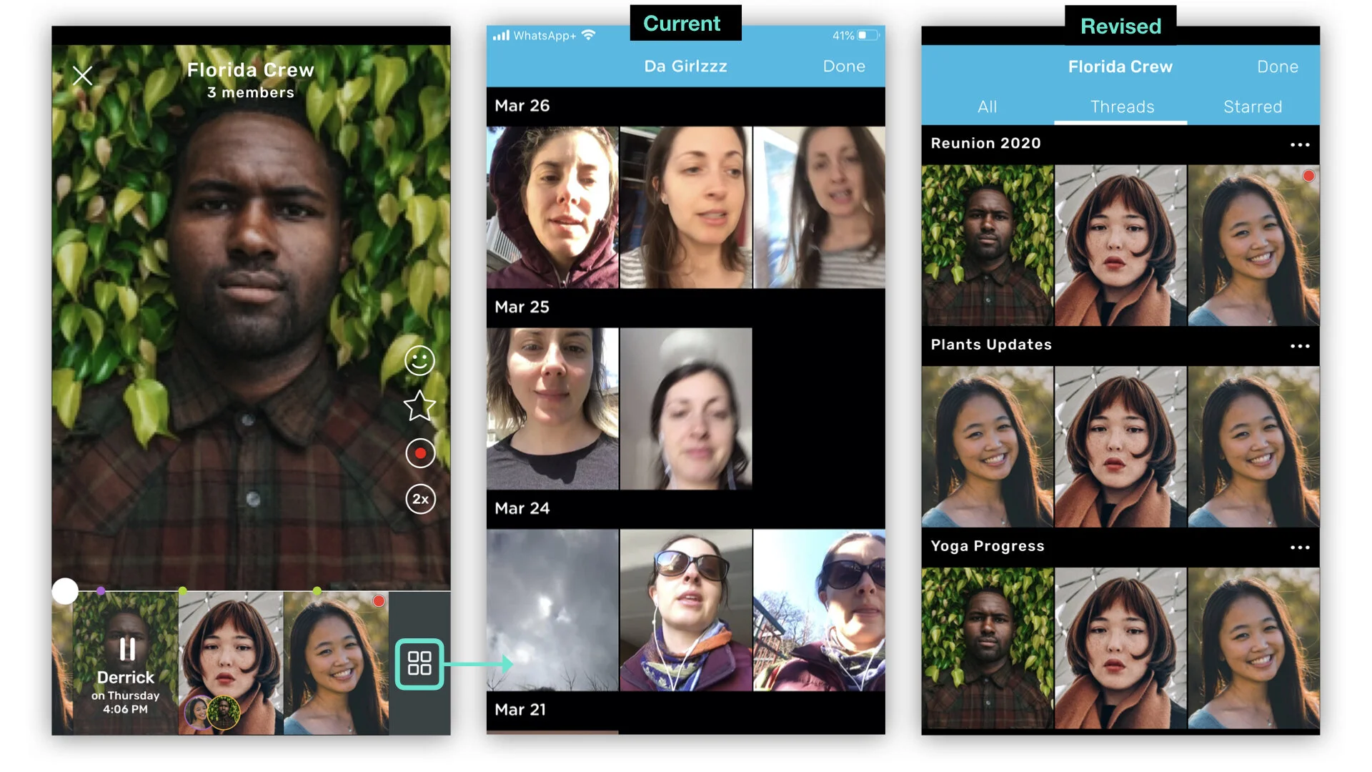
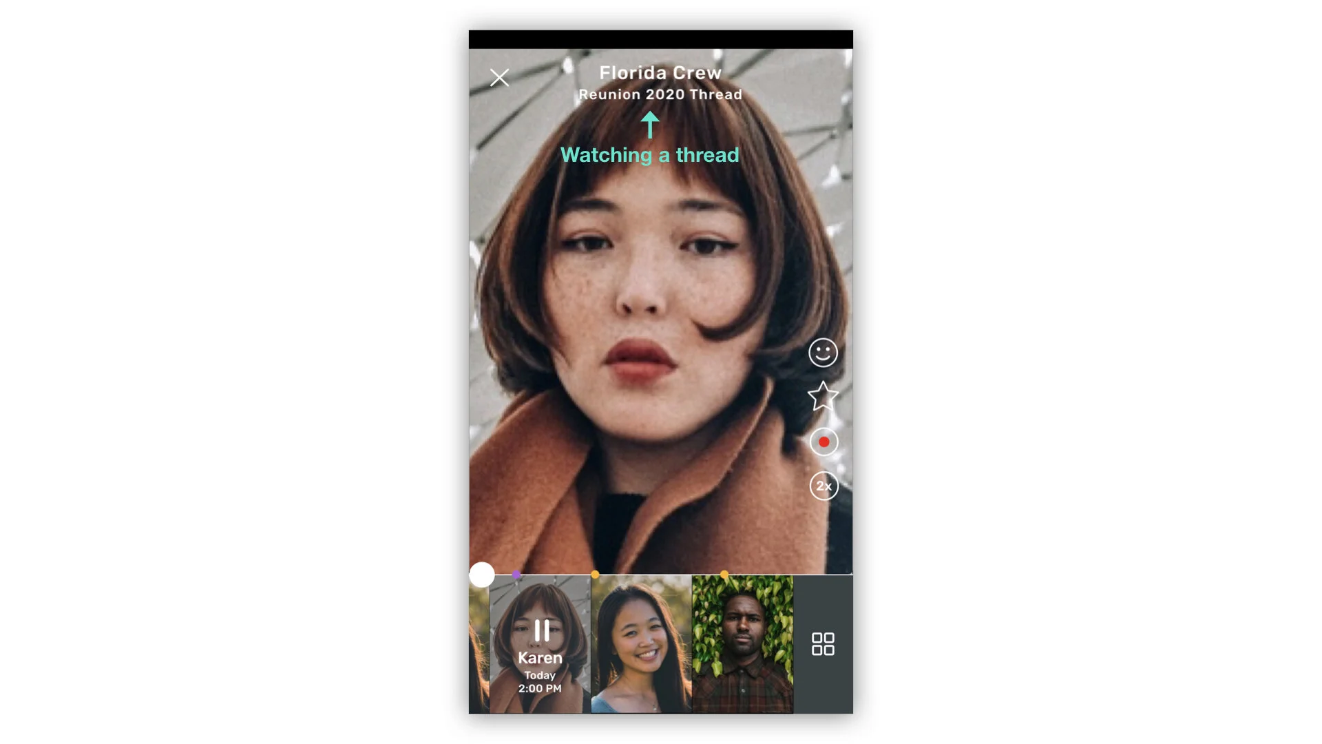
#3: Watching a thread.
Watching threads would function the same as the main conversation, except the title of the thread would appear below the group name, rather than the number of people in the group. When the user clicked the "x", it would take them back to the main conversation stream for that chat.
User Experience #3: Favorite Moments
The problem:
Just like in real life conversations, sometimes there is a moment that just stands out from the rest. Maybe it’s a golden piece of advice, a funny joke, or just a moment too special to forget. While Marco provides a space for users to share those moments, the sheer amount of videos in each chat plus the varying lengths of each video makes it hard to retrieve them at a later time. Bookmarking is one option, but this saves the entire video, which can sometimes be many minutes long, once more loosing the valued moments.
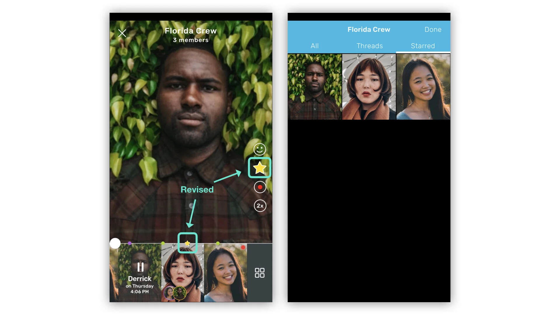
My proposed solution:
Give the users a new reaction option: favoriting moments with a star reaction. When the user clicks the star, a clip containing 10 seconds before and 5 seconds after the starred moment will be sent to the “starred” folder. The user can then easily find those exact moments whenever they want to.
My takeaways from this endeavor
Redesigning this app taught me how much thought goes into a deceivingly simple interface, as well as many valuable rapid wireframing and prototyping skills. It was a really fun way to continue developing my design thinking muscles and to really appreciate the great work of those at Marco Polo.
If you would like to play around with the clickable prototype, use this link. To leave a comment on this project please visit my Behance site. Thank you so much for reading!